

Do you want to create your very first Speckle App and get your hands dirty dealing with Speckle data? But you only know Python and creating a web app takes more than that, right? Until recently this required learning web development and starting complex React or Angular projects but not anymore.
In this tutorial, you are going to create your very first Speckle App using only Python. This app will analyze the selected stream from a given account and return some statistics about it. It will be a great exercise to understand the basics of interacting with the Speckle server and Speckle data structure. Let's go 🚀!
::: tip What Will You Build🔨?
⭐️ Check out the code right here!
:::
Prefer watching than reading? Take a look at this playlist👇
Requirements
Since we are going to use Python and deal with Speckle server, knowledge about both is assumed. But don’t worry, you don’t have to be an expert in Python, just being comfortable using it will let you get started.
You will need an account with a Speckle Server. Don't have one? It takes less than a minute to register one now!
::: tip Python Libraries🐍
To follow this tutorial you'll need the following libraries:
- Streamlit👑
- SpecklePy🔹
- Pandas🐼
- Plotly📊
:::
Installing Libraries
Make sure you have pip installed on your computer. Pip is the package installer for python. Once you have pip, you can go ahead and install libraries.
Streamlit👑
Streamlit is an amazing tool that makes it extremely easy to build an interactive front-end. It is specially made with data science projects in mind and thus has a lot of useful functionality to show off your projects.
This is how you install it👇:
pip install streamlit
SpecklePy🔹
SpecklePy is a Python library that allows us to interact with Speckle server, receive streams and commits from the server. SpecklePy repo can be found here👈
This is how you install it👇:
pip install specklepy
Pandas🐼
Pandas is an open-source library that is made mainly for working with relational or labeled data both easily and intuitively. It provides various data structures and operations for manipulating numerical data and time series.
We are going to use it mainly for converting Speckle objects to Pandas’ DataFrames.
This is how you install it👇:
pip install pandas
Plotly📊
Plotly is an open-source Python graphing library that is great for building beautiful and interactive visualizations. You are going to use Plotly Express in specific. Visualizations you are going to create using it are:
- Bar chart
- Donut chart
- Line chart
This is how you install it👇:
pip install plotly-express
Coding Begins👨💻
After you are done installing libraries, create a folder where you will have everything for your front-end in. Inside that folder, create a python file called main.py.
Open it in your choice of Python IDE. I’ll be using Visual Studio Code in this tutorial.
Importing Libraries
Now it’s time to code! Open your main.py file and lets import libraries.
#--------------------------
#IMPORT LIBRARIES
#import streamlit
import streamlit as st
#specklepy libraries
from specklepy.api.client import SpeckleClient
from specklepy.api.credentials import get_account_from_token
#import pandas
import pandas as pd
#import plotly express
import plotly.express as px
#--------------------------
From SpecklePy library you’ll import SpeckleClient which allows you to interact with the server API and get_account_from_token that authenticates your account using a token.
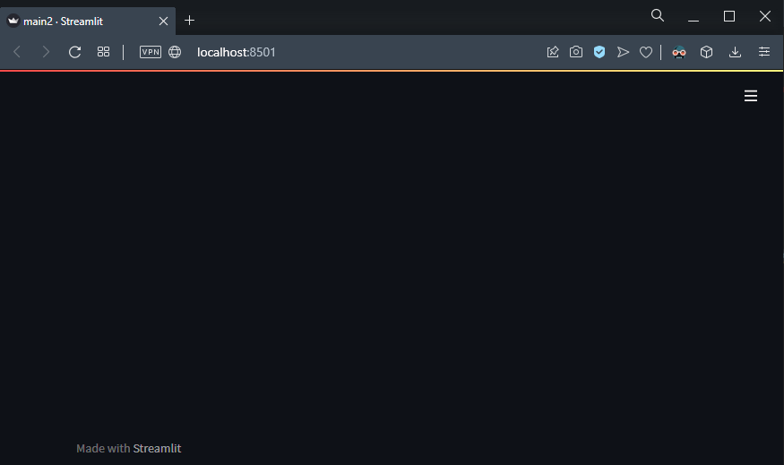
At this point you want to see what the app looks like. So open up a terminal window and make sure to navigate to the folder where you have main.py file. Then run:
streamlit run main.py
The browser window will automatically pop up and here is what you’ll see:
Lets start with setting the page title and page icon.
#--------------------------
#PAGE CONFIG
st.set_page_config(
    page_title="Speckle Stream Activity",
    page_icon="📊"
)
#--------------------------
After we set it, this is how it looks like👇:

Structure of the Page📄
|
|
Basically, this page will contain 5 sections:
|
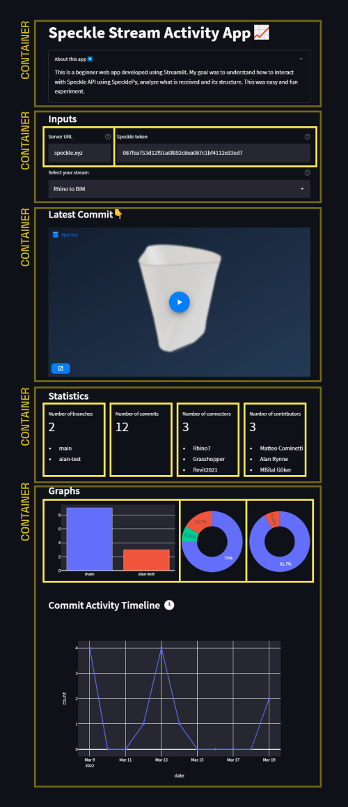
Creating containers that’ll store the info will be the first step. We have 5 sections, for each section I’ll create a container using st.container().
#--------------------------
#CONTAINERS
header = st.container()
input = st.container()
viewer = st.container()
report = st.container()
graphs = st.container()
#--------------------------
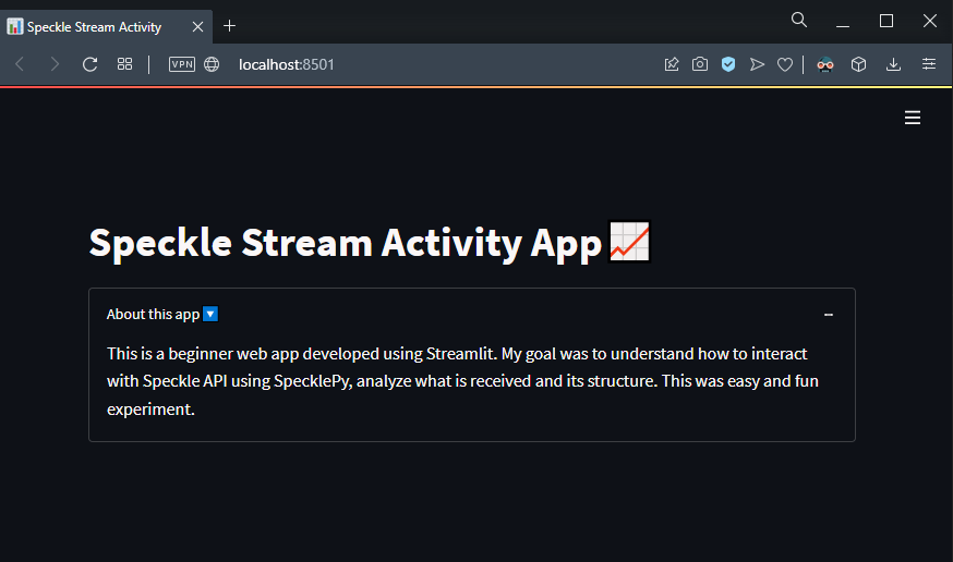
Header
To create code that belong to a certain container, we have to use with divider. I’ll set my page title using title method and use an expander component to add the description.
#--------------------------
#HEADER
#Page Header
with header:
    st.title("Speckle Stream Activity App📈")
#About info
with header.expander("About this app🔽", expanded=True):
    st.markdown(
        """This is a beginner web app developed using Streamlit. My goal was to understand how to interact with Speckle API using SpecklePy,
        analyze what is received and its structure. This was easy and fun experiment.
        """
    )
#--------------------------
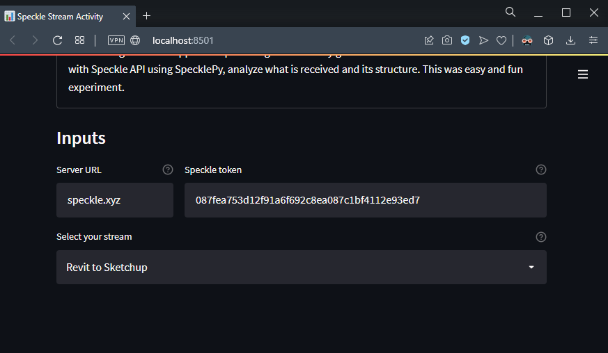
After this you may want to see what app looks like. So let’s use streamlit run main.py again. This is how it looks like👇:
Collect User Input
This is the most important part because we are going to start dealing with Speckle data. First lets start by defining the columns that’ll store the inputs.
with input:
    st.subheader("Inputs")

    #-------
    #Columns for inputs
    serverCol, tokenCol = st.columns([1,3])
    #-------
Pay attention to what I did in st.columns. I created a list of values that defines the ratios of columns relative to each other. This way tokenCol‘s width is 3 times of serverCol's width.
Let’s continue with Input boxes. To associate a component with a column, we are replacing st with columns name. This way, text inputs will be placed into that column and use the width of it.
    #-------
	#User Input boxes
    speckleServer = serverCol.text_input("Server URL", "speckle.xyz", help="Speckle server to connect.")
    speckleToken = tokenCol.text_input("Speckle token", "087fea753d12f91a6f692c8ea087c1bf4112e93ed7", help="If you don't know how to get your token, take a look at this [link](<https://speckle.guide/dev/tokens.html>)👈")
    #-------
Interacting with Speckle Server
Let’s take a look at how to receive data from Speckle. First, you'll need to create and authenticate a client. We’ll use Server URL and Speckle Token to authenticate. For both, we created text inputs and defined variables in the previous section.
	#-------
    #CLIENT
    client = SpeckleClient(host=speckleServer)
    #Get account from Token
    account = get_account_from_token(speckleToken, speckleServer)
    #Authenticate
    client.authenticate_with_account(account)
    #-------
Now that you have an authenticated client, you can start interacting with the API. Let’s get all the streams and create a dropdown menu that shows their names.
	#-------
    #Streams List👇
    streams = client.stream.list()
    #Get Stream Names
    streamNames = [s.name for s in streams]
    #Dropdown for stream selection
    sName = st.selectbox(label="Select your stream", options=streamNames, help="Select your stream from the dropdown")
- Started by defining a new variable called
streamsthat’ll store all the streams. - Looped through this list and got their names, stored in
streamNamesvariable. - Created a dropdown menu using
st.selectboxand set thestreamNamesas the options input. - Selected stream will be stored in
sName.
Once the user selects a stream from the dropdown, you have to somehow find the stream that has the selected name. SpecklePy has a search function just for that.
	#SELECTED STREAM ✅
    stream = client.stream.search(sName)[0]
📌 Search function returns a list of streams. But we only need a single item. That’s why I get the first item from returned list.
After we got the stream, I’ll create two more variables that’ll store branches and commits of the stream.
	#Stream Branches 🌴
    branches = client.branch.list(stream.id)
    #Stream Commits 🏹
    commits = client.commit.list(stream.id, limit=100)
    #-------
Let’s take a look at how the page looks like.
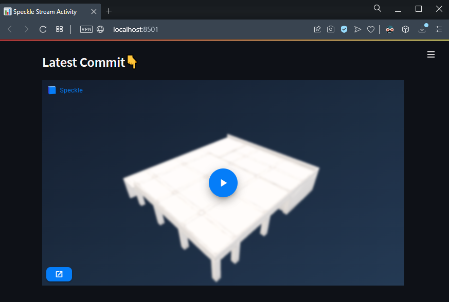
Embed Viewer IFrame👁🗨
In this section we’ll see how to embed Speckle Viewer into your app. First go to a speckle commit and take a look at the structure of the URL.

By replacing Stream ID and Commit ID we can access to a different commit. By taking advantage of this and using a custom iframe component, let’s create a function that generates a Viewer IFrame.
#--------------------------
#create a definition that generates an iframe from commit id
def commit2viewer(stream, commit, height=400) -> str:
    embed_src = "<https://speckle.xyz/embed?stream="+stream.id+"&commit=>"+commit.id
    return st.components.v1.iframe(src=embed_src, height=height)
#--------------------------
Definition below accepts 2 inputs, stream and commit. We already defined stream variable in previous sections and we’ll get the latest commit made from the commits list.
#--------------------------
#VIEWER👁🗨
with viewer:
st.subheader("Latest Commit👇")
commit2viewer(stream, commits[0])
#--------------------------
Voila! Let’s see how it looks like. So far you are doing great. It’s not that complicated, right?
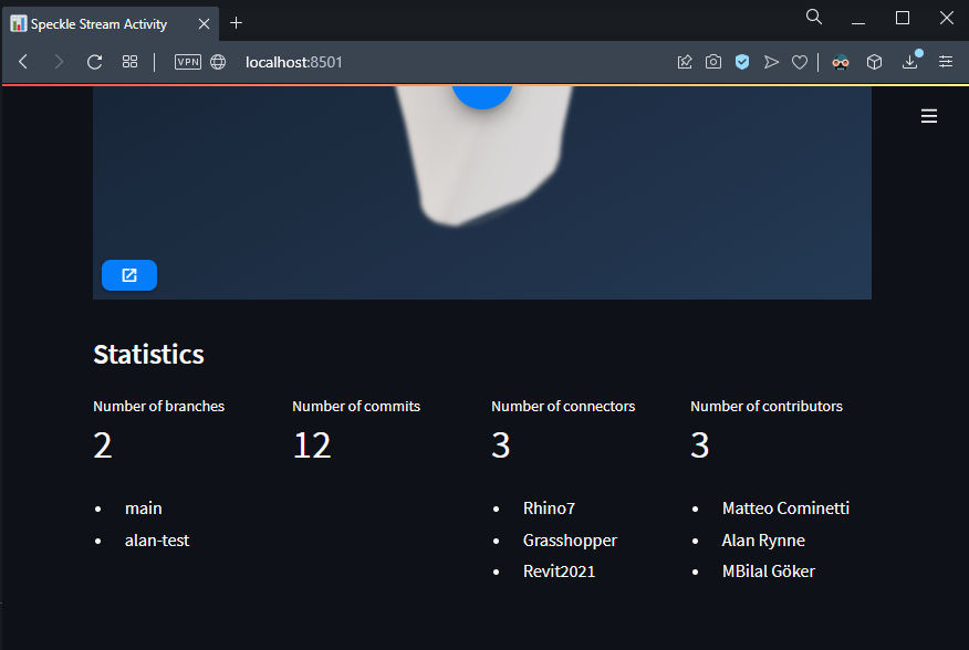
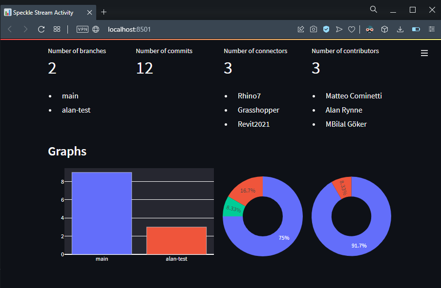
Statistics
We’ll start by defining the columns.
with report:
    st.subheader("Statistics")

    #-------
    # Columns for Cards
    branchCol, commitCol, connectorCol, contributorCol = st.columns(4)
    #-------
branchColwill store the number of branches and their details.commitColwill show the number of commits made.connectorColwill show the unique source applications for commits made.contributorColwill show number of collaborators and their names.
Before we start adding metric, lets define a new function that’ll convert a Python list into a Markdown list.
#--------------------------
#DEFINITIONS
#create a definition to convert your list to markdown
def listToMarkdown(list, column):
    list = ["- " + i + " \\n" for i in list]
    list = "".join(list)
    return column.markdown(list)
#--------------------------
Let’s start adding some metrics and show their details.
Branches🌴
		#-------
    #Branch Card 💳
    branchCol.metric(label = "Number of branches", value= stream.branches.totalCount)
    #branch names as markdown list
    branchNames = [b.name for b in branches]
    listToMarkdown(branchNames, branchCol)
    #-------
We’ll get the total count of branches and use that as the value input in metric component. Created a list that stores the names of branches and show that in a Markdown list using the function created earlier.
Commits Metrics🏹
    #-------
    #Commit Card 💳
    commitCol.metric(label = "Number of commits", value= len(commits))
    #-------
We’ll show the length of the commits list as the metric.
Connector Metrics 🔗
    #-------
    #Connector Card 💳
    #connector list
    connectorList = [c.sourceApplication for c in commits]
    #number of connectors
    connectorCol.metric(label="Number of connectors", value= len(dict.fromkeys(connectorList)))
    #get connector names
    connectorNames = list(dict.fromkeys(connectorList))
    #convert it to markdown list
    listToMarkdown(connectorNames, connectorCol)
    #-------
- Started by defining a new variable
connectorList. Looped through each commit incommitslist and get theirsourceApplicationproperty. - Got the number of unique values from this list and showed its length as the number of connectors.
- Showed the unique values from this list in a markdown list.
Contributor Card🦸♂️
	  #-------
    #Contributor Card 💳
    contributorCol.metric(label = "Number of contributors", value= len(stream.collaborators))
    #unique contributor names
    contributorNames = list(dict.fromkeys([col.name for col in stream.collaborators]))
    #convert it to markdown list
    listToMarkdown(contributorNames,contributorCol)
    #-------
- We get the collaborators property from
streamobject. - Showed the length of it as the number.
- Created a markdown list from names of the contributors.
These are the metrics we’ll show. Let’s how it looks like in the front end.
Not bad, huh? Let’s continue with the Graphs🏃♂️!

Let’s Visualize Some Metrics
A container for the graphs was already created lets start by referencing that and define columns that will store the figures.
#--------------------------
with graphs:
    st.subheader("Graphs")
    #COLUMNS FOR CHARTS
    branch_graph_col, connector_graph_col, collaborator_graph_col = st.columns([2,1,1])
We set the width of branch_graph_col 2 times the width of other columns.
Branch Graph 📊
		#-------
    #BRANCH GRAPH 📊
    #branch count dataframe
    branch_counts = pd.DataFrame([[branch.name, branch.commits.totalCount] for branch in branches])
    #rename dataframe columns
    branch_counts.columns = ["branchName", "totalCommits"]
    #create graph
    branch_count_graph = px.bar(branch_counts, x=branch_counts.branchName, y=branch_counts.totalCommits, color=branch_counts.branchName, labels={"branchName":"","totalCommits":""})
    #update layout
    branch_count_graph.update_layout(
        showlegend = False,
        margin = dict(l=1,r=1,t=1,b=1),
        height=220)
    #show graph
    branch_graph_col.plotly_chart(branch_count_graph, use_container_width=True)
    #-------
- Create a new Pandas Dataframe that’ll store the branch names and total count of commits made by looping through the branches list and getting corresponding attributes.
- Rename columns to
branchNameandtotalCommits - Create a Plotly Bar chart using
px.barand set corresponding options. - Update the layout of figure so it won’t show legend, will have height of 220.
- Finally add the figure to
branch_graph_colcolumn and set theuse_container_widthoption toTrue.
Connector Chart 🍩
		#-------
    #CONNECTOR CHART 🍩
    commits= pd.DataFrame.from_dict([c.dict() for c in commits])
    #get apps from commits
    apps = commits["sourceApplication"]
    #reset index
    apps = apps.value_counts().reset_index()
    #rename columns
    apps.columns=["app","count"]
    #donut chart
    fig = px.pie(apps, names=apps["app"],values=apps["count"], hole=0.5)
    #set dimensions of the chart
    fig.update_layout(
        showlegend=False,
        margin=dict(l=1, r=1, t=1, b=1),
        height=200,
        )
    #set width of the chart so it uses column width
    connector_graph_col.plotly_chart(fig, use_container_width=True)
    #-------
- First, create a Pandas DataFrame from commit objects by looping through
commitslist. - Get the
sourceApplicationcolumn from the newly created dataframe. - Get the unique values, reset the index and rename columns.
- Generate a pie chart using
px.pieand create a hole of 0.5 - Update the layout of the figure so it won’t show the legend, will have a height of 200.
- Finally, add the figure to
connector_graph_coland set theuse_container_widthoption toTrue.
Collaborator Chart 🍩
		#-------
    #COLLABORATOR CHART 🍩
    #get authors from commits
    authors = commits["authorName"].value_counts().reset_index()
    #rename columns
    authors.columns=["author","count"]
    #create our chart
    authorFig = px.pie(authors, names=authors["author"], values=authors["count"],hole=0.5)
    authorFig.update_layout(
        showlegend=False,
        margin=dict(l=1,r=1,t=1,b=1),
        height=200,
        yaxis_scaleanchor="x",)
    collaborator_graph_col.plotly_chart(authorFig, use_container_width=True)
    #-------
- Get the
authorNamecolumn from the newly createdcommitsdataframe. - Get the unique values, reset the index and rename columns.
- Generate a pie chart using
px.pieand create a hole of 0.5 - Update the layout of the figure so it won’t show the legend, will have a height of 200.
- Finally, add the figure to
connector_graph_coland set theuse_container_widthoption toTrue.
Let’s take a look at the front end again👁🗨
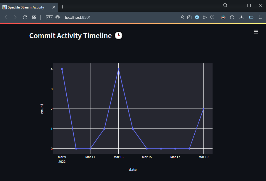
Commit Activity Timeline 📈
Lastly, we’ll create a timeline chart that shows the number of commits made per day.
		#-------
    #COMMIT PANDAS TABLE 🔲
    st.subheader("Commit Activity Timeline 🕒")
    #created at parameter to dataframe with counts
    cdate = pd.to_datetime(commits["createdAt"]).dt.date.value_counts().reset_index().sort_values("index")
    #date range to fill null dates.
    null_days = pd.date_range(start=cdate["index"].min(), end=cdate["index"].max())
    #add null days to table
    cdate = cdate.set_index("index").reindex(null_days, fill_value=0)
    #reset index
    cdate = cdate.reset_index()
    #rename columns
    cdate.columns = ["date", "count"]
    #redate indexed dates
    cdate["date"] = pd.to_datetime(cdate["date"]).dt.date
    #-------

    #-------
    #COMMIT ACTIVITY LINE CHART📈
    #line chart
    fig = px.line(cdate, x=cdate["date"], y=cdate["count"], markers =True)
    #recolor line

    #Show Chart
    st.plotly_chart(fig, use_container_width=True)
    #-------
- Get
createdAtproperty from thecommitsdataframe. - Get unique values, reset index and sort values.
This list will contain all the dates when a commit made and their counts. But it won’t show the dates where no commits made. We want to see those dates as well. Let’s add them.
- First, get the first and last dates from the list and generate a date range using
pd.date_range. - Lets set these dates as the index of the dataframe and fill cells that has no value as 0.
After this we’ll end up with a list that has all the dates within that range. Each date will have the number of commits too (even dates where no commit is made.)
- Reset index and rename columns so they make sense.
- Then we’ll gate the date only from date object.
Finally the creation of chart:
- We’ll create a line chart that’ll use the date column as the x axis and the count column as the y axis. Let’s enable markers too.
- Lastly, show newly created figure using st.plotly_chart and set its use_container_width to True.
Let’s see how it looks like in the front end👇:

Conclusion
We hope you enjoyed this tutorial and found it useful!
Speckle is an Open Source project and we really ❤️ feedback, so if you have any questions, comments, critiques, or praises please let us know on our community forum.