
Extending received data with an external data source is particularly useful considering not all relevant AEC data may not live inside BIM applications, in this case Revit. For example, your Excel sheet might contain information about your built elements that are missing in the BIM model.
Video Tutorial
Tutorial Files
If you wanna follow this tutorial and use the files i used, you can download the Excel file from down below:
Here is the link to Speckle model that contains the Revit data:

Scenario
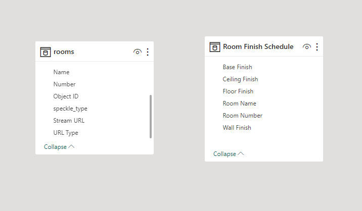
In this scenario, we are using Autodesk Revit 2024’s sample Snowdon Tower’s Architectural model. We’ve created a project on Speckle and created a Speckle model for the data we are going to send from Revit. We sent the Rooms category to the newly created Speckle model.
We also have an Excel table with Finish information for each surface in the room. These two data sources need to be connected so that we can visualize the room finishes data in relation to 3d data in Power BI.
Importing Excel Data
Let’s start by importing Excel data into Power BI:
- Click on “Excel Workbook” and select your Excel file.
- Choose the sheet containing your data and click “Load”.
- Your Excel table will now be available in Power BI.
Establishing the Relationship
Now we imported the Excel workbook, our both data sources are available inside Power BI. But they are completely isolated, not having any relation to each other. Let’s establish a relation, so we can use the Excel data to interact with the BIM model.
- Switch to “Model View”.
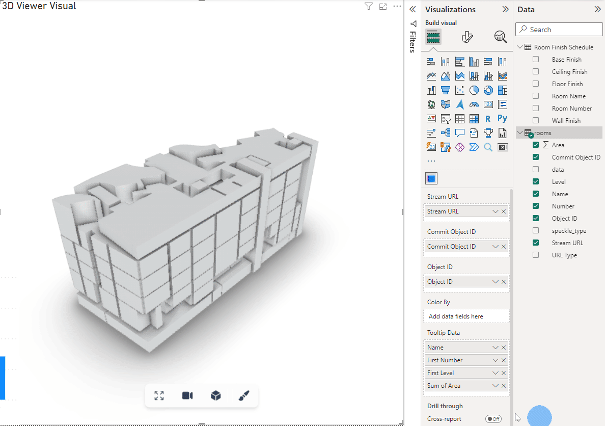
- Drag the “Room Number” column from Excel to “Number” column from Revit.
::: tip
We won’t cover how to extract properties from received Revit elements in this tutorial. We have another tutorial that shows how to do that. Take a look.
:::
That’s it! Now you created a connection between Excel and Revit per Room Number. Each row from Excel will be used to extend the corresponding room elements.
Coloring Rooms using Excel Data
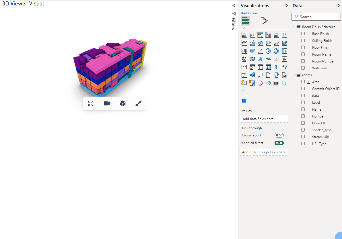
Now we created the connection between the two data sources, we can color our elements in 3D using the Excel data. Simply drag any column from Excel to the Color By input in 3D Visual.
Visualizing Excel Data in Combination with Revit Data
Let’s create a clustered column chart that shows the total Area of each Finish, e.g. Floor Finish.
- Add a stacked clustered column chart to your dashboard.
- Configure the X-axis with “Floor Finish” column from Excel
- Configure the Y-axis with Room Area.
That’s it! This chart uses data from both sources, and shows accurate results for each floor finish. When you select an item in the chart they also get highlighted in other visuals, including 3D Viewer Visual. Don’t belive us? See it yourself:
Conclusion
You've successfully created an interactive dashboard by merging Revit and Excel data in Power BI. Remember that this workflow can be expanded to include other relationships between various data sources. Feel free to experiment and create insightful dashboards tailored to your needs.
If you encounter any issues, visit our forum at sparkle.community for assistance.